Follow These Simple Rules
A PRACTICAL LOOK AT PRINTING
You don’t have to go broke with specialized software. One the realm of high-end software like PageMaker or Adobe, Bill Gates rose to the challenge, and built-in features in Microsoft Word (2003 version shown here). Think about layout, follow the rules of good design, and you are home free. (One page PDF file)AMAZING FREE TRAINING
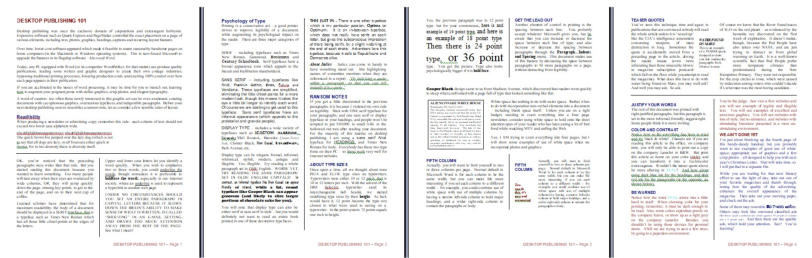
Another one-page summary of some of the more useful techniques in giving your printed words new vitality And just two or three fonts handle the entire page. Times Roman for body copy (most readable for smaller print), Arial for headings, and just a smidge of a display font to wrap things up (one-page PDF file.
Dots on a Page
DESKTOP PUBLISHING 1O1
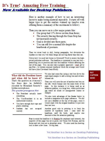
Take the time to read this four-page PDF file, then print it (and the other one- page exemplars) for your constant reminder of what keeps your thoughts readable. No ransom notes please (just because you have 500 ttf fonts in your system doesn’t mean you need to use them all at once). My favorite font? OPTIMA (a sans serif font - like Arial, but with just a hint of beveled edges suggesting a serif once passed by the type foundry).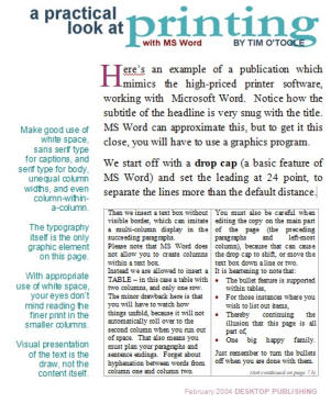

DOTS ON A PAGE - is not only
about music, or megapixel photos.
In fact, the dots are also what you
are looking at right now. An InkJet
printer is really just the ultimate dot
matrix printer.
We’ve come a long way from clay tablets and papyrus.